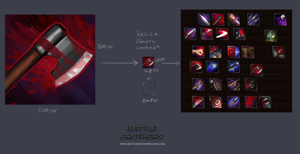
Here´s the basic painting process of a typical skill icon.
I start out with a pretty rough painting of the skill in 500×500 pixels size. You don´t need a lot of details here, it all comes down to colors and contrasts when you resize it to the final 48×48 pixels size. I go back and forth a lot to check if the icon is clearly readable and how it compares to the already existing icons.
When resizing I use “smart sharpen” with 35% and on top of that an +20 brightness +20 contrast action to give the icon some extra punch.
Cheers!

-
This reply was modified 12 years, 2 months ago by
 PsenBattle.