Back from our short trip to Malmö, we’re busy again working on the UI as per last week’s progress update. Things are progressing well: The game feels a lot smoother already and the UI now looks like it actually belongs to a game. We’re about halfway done, so let’s take a look!
The new Look & Feel
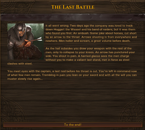
The UI in Battle Brothers is now made from real materials that fit the setting: wood, metal and paper. This makes it feel much more as a part of the game world and actively contributes to the game’s atmosphere. Below is an example of how dialog screens now look – made of wood with decorative viking-esque carvings and a metal band. Note that the text color for everything is something we’ll adjust at the very end.
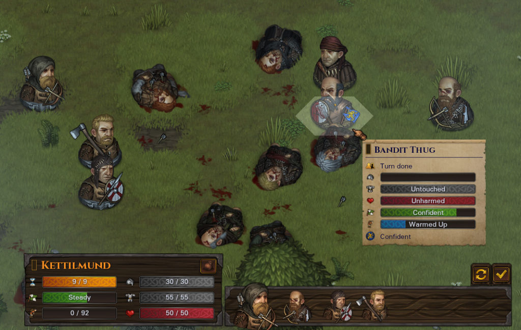
The same look and feel of wood and metal is also used for the combat UI. All the buttons got a makeover to be more clear in their function and fit within the design. Tooltips now have the look of pieces of paper and small scrolls, written on with ink. Aside from their visual upgrade, they also come with some improvements in functionality. For example, as you can see in the screenshot below, any status effects are now listed complete with their name underneath each other. No need to learn every icon by heart anymore!
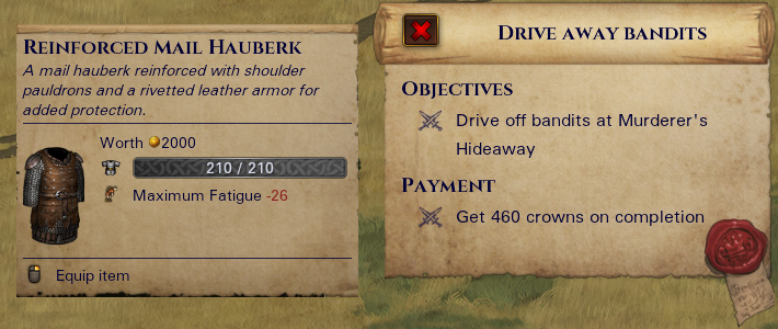
Similar to how tooltips are now scraps of paper, we’ve also made the panel showing the current objectives a scroll bearing the seal of your employer. Whenever it made sense and didn’t detract from the usability, we’ve tried to incorporate real objects that would be part of mercenary life into the UI.
A shout-out
Finally, we want to give a shout-out to the devs behind Unclaimed World and Wartile – we had a great time chatting with you guys at the Nordic Game!


This is a great step forward for the UI. Thanx guys.
It takes a lot of work, but I think its worth it :)
I hate to say this, but the new UI looks like ass.
I disagree, I typically dont like these types of material UI’s as they end up low resolution and what not, but this looks high quality and actually merges with the game world just like they said!
Looks great! Reworked UI going to give even more,,soul” for game. That’s really important :)
Exactly, it greatly helps the immersion. Glad you like it.
Looks normal. Not pink pony – that’s ok for me. More interesting what the new UI can make for gameplay.
Looks amazing! :)
I’m a real fan from your art team. You guys do such a nice job.
well you be able to join factions in the game or what I mean will you be able to get help from a allied factions I mean if you have to attack like an army of orcs and you don’t have the worlds best soldiers so can you request like 3 or 4 soldiers of a allied faction and militia if you are allied with just a town not a kingdom and get your own standard bearers with your own flag on it? PS I see there is a lot of goods in the world I was just wondering would you at base building and armor and weapon crafting, because other then selling goods they are not use full so adding a system of crafting and base building would be good and another idea of base building if you don’t want to carry all 18 troop it would be could to put them in the base and level up and why level because if you have a level 1 in your Reserves and you have a level 8 that dies thats 7 levels you loss so it would be nice to have a base to level up your Reserves well like every 5 or 6 days pass you Reserves level up once this would be nice because I hate losing a level 7 or 8 soldier and then having to replace them with a level 1 soldier and then have to work on leveling them up.