
Login
Topic: "beta" UI – My first impressions
Home › Forums › Battle Brothers: Game Discussion & Feedback › "beta" UI – My first impressions
- This topic has 15 replies, 10 voices, and was last updated 9 years, 9 months ago by
 Sarissofoi.
-
AuthorPosts
-
21. June 2016 at 23:35 #15607OldGreyBeardParticipant
Freaking Sweet Doggies, this is awesome!! 8-D
At last! I have a reserve where I can have some decent brothers ready to fill the gaps when a contract goes badly.
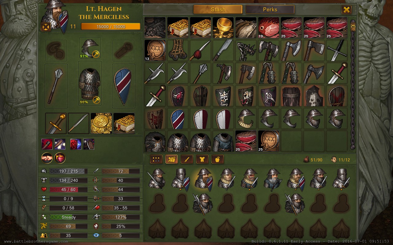
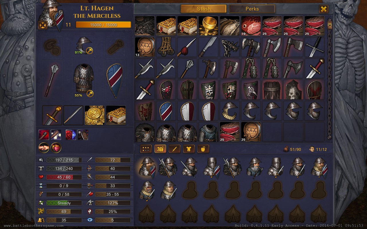
I find the new interface much easier to read, and way more fitting with the game atmosphere.
The parchment background is very nice.
I’m very pleased to find it fully save game compatible.
I have noticed a greater lag when loading a town. It happens in stages, and it’s slower. Also, the various locations (hiring, market, kennel) load slower as well. BUT it’s SO WORTH IT to get that new UI!
And now, the one thing I think you should change: The “glow” around the enhanced/legendary items needs to be changed to something besides a lighter brown. I honestly thought the enhanced items were lost in the update when I first saw them in the new UI. Blue, green, red, whatever, just not brown, yellow or beige.
In a single player game, there's no such thing as cheating. It's merely "creative manipulation of the default settings"!
22. June 2016 at 00:15 #15608 DanubianParticipant
I vote for blue or some other color thats easy on the eyes.
Or even better no color at all but some sort of mark, something not too aggressive and immersion breaking.
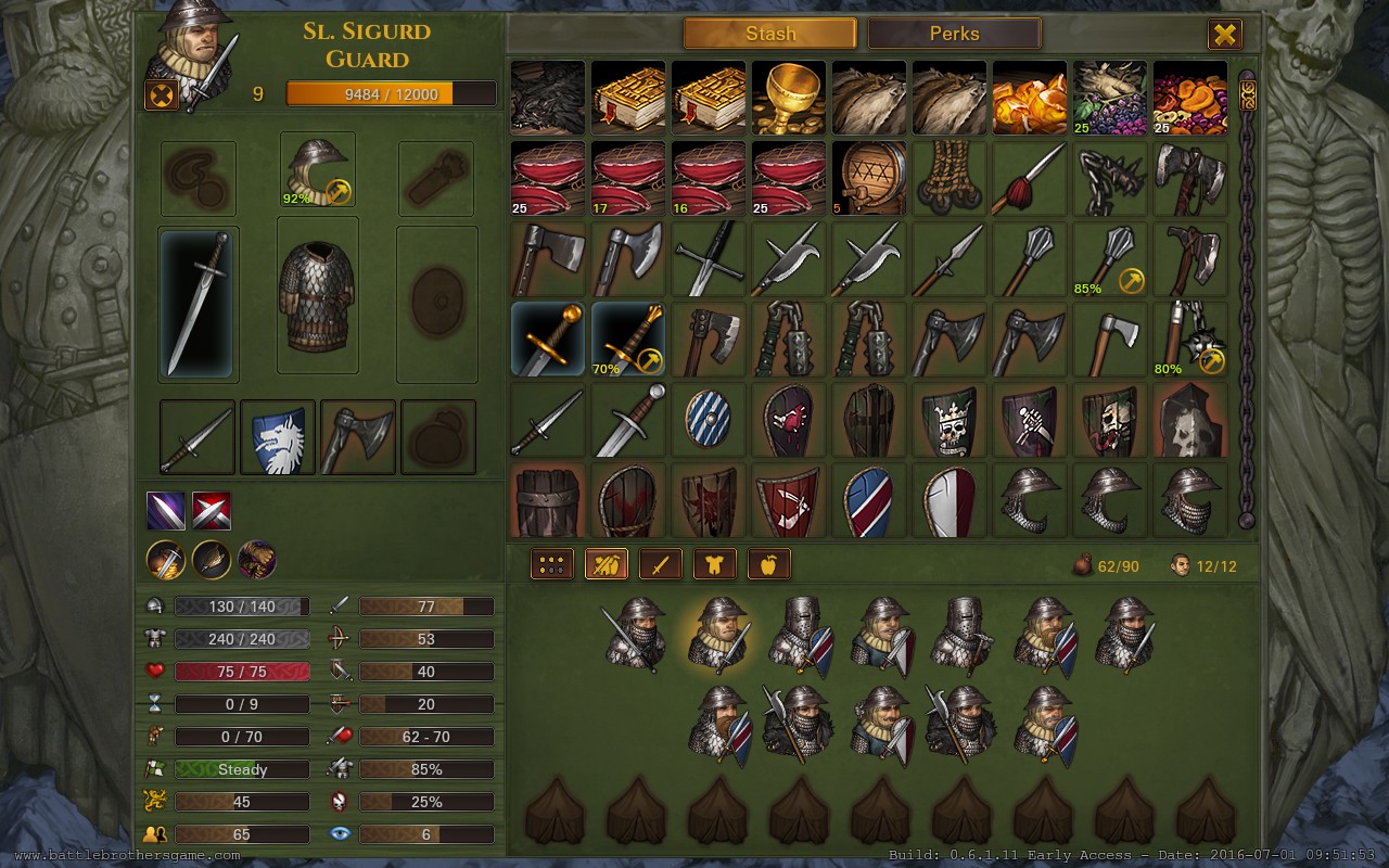
25. June 2016 at 15:22 #15652RusBearParticipantSo…new UI( don’t talk about some bugs here) looks good.
Especially if we take in mind the fact that its all-still had to be remodeled and – most importantly, that now we were able to somehow placed mercenaries before fight. weak but still. However, in my view background in trade window and loot brake the whole good picture. Even not the background and the fact that items – goods lose their contours and illegible. As the developers have mentioned that this is not the final version, I decided that it makes sense to pay attention to it.25. June 2016 at 17:55 #15656spamtabooParticipantFirst of all the new UI is great, tremendous job! The only flaw for me is trading screen. % of durability stands too close to a price and personally for me it requires additional focus to compare prices or tell if the item worth selling here.
4. July 2016 at 00:32 #15804SarissofoiParticipantI vote for blue or some other color thats easy on the eyes.
Or even better no color at all but some sort of mark, something not too aggressive and immersion breaking.
4. July 2016 at 01:52 #15805SarissofoiParticipant4. July 2016 at 23:13 #15825Wouter LievensParticipantI for one love how it looks! It also feels a lot smoother.
5. July 2016 at 18:21 #15854MeekyParticipantSariss, I’m pretty sure Danubian meant we should change the color of the “glow” to be blue or green. And I agree with Danubian: that’d make the rares a lot easier to see. Although… a yellow would be perfectly fine as well, but the right shade of yellow would need to be found to make it stand out.
Also, you know how food items have a color that tells you when they’ll go bad? That needs to be changed somehow. As of now, if the right food is in the right stage of spoiling, you can barely – or not at all – read the amount of provisions you have for that specific food item. Perhaps if a little black box were put in the bottom-left corner of items and the number of the item / price of the item were displayed there? Or a semi-transparent black box?
5. July 2016 at 20:34 #15859SarissofoiParticipantSariss, I’m pretty sure Danubian meant we should change the color of the “glow” to be blue or green. And I agree with Danubian: that’d make the rares a lot easier to see. Although… a yellow would be perfectly fine as well, but the right shade of yellow would need to be found to make it stand out.
What about this?
6. July 2016 at 16:02 #15879DanubianParticipantSariss, I’m pretty sure Danubian meant we should change the color of the “glow” to be blue or green. And I agree with Danubian: that’d make the rares a lot easier to see. Although… a yellow would be perfectly fine as well, but the right shade of yellow would need to be found to make it stand out.
Also, you know how food items have a color that tells you when they’ll go bad? That needs to be changed somehow. As of now, if the right food is in the right stage of spoiling, you can barely – or not at all – read the amount of provisions you have for that specific food item. Perhaps if a little black box were put in the bottom-left corner of items and the number of the item / price of the item were displayed there? Or a semi-transparent black box?
Yup thats what i meant.
27. July 2016 at 09:01 #16324RusBearParticipantI have a question to Rap or to those who playing a lot after patch with new UI. Are events based on the background of the character (a tailor, a swordmaster, etc.) works if a mercenary is in the reserve?
Yes! I had event with minstrel when he was in reserve.
Tnx for info.
27. July 2016 at 09:09 #16325Andrew Sorry for my bad english KleinerParticipantI have a question to Rap or to those who playing a lot after patch with new UI. Are events based on the background of the character (a tailor, a swordmaster, etc.) works if a mercenary is in the reserve?
Yes! I had event with minstrel when he was in reserve.
29. July 2016 at 15:29 #16360Harry_KrishnaaParticipantI realy like the new UI… but i misslike the DISMISS button… its to big and destroy the nice picture of my Brother. Also i think the Brother picture could be bigger. I love to watch my Brother portraits :(

Attachments:
29. July 2016 at 17:55 #16366RapKeymaster29. July 2016 at 19:24 #16368Harry_KrishnaaParticipantnice !
-
AuthorPosts

- You must be logged in to reply to this topic.