Login
Topic: Paul´s Art Corner
Home › Forums › Battle Brothers: Game Discussion & Feedback › Paul´s Art Corner
Tagged: Universal Mod at Battle Brothers
- This topic has 1,775 replies, 175 voices, and was last updated 10 months, 3 weeks ago by
 Zaxxsel.
-
AuthorPosts
-
30. October 2018 at 13:52 #23224
 juanvalParticipant
Thanks Paul for sharing your art. Great to see more different weapons ;)
I’d like to use tower shields on BB, but they reduce 20 max fatigue and I think is too much. It would be interesting to see tower shields created in cities (instead of ancient tower shields) with -16 max fatigue.
30. October 2018 at 14:24 #23225 Love GunParticipant
Actually our Kraken has a bit of a different backstory and is an inhabitant of swamps, rather than the sea. In our latest Blog Post there’s some more info on it if you are interested: Kraken Blog
Considering our Krakens habitat it would’nt really make sense to use any maritime symbolism.
In the case our our Banner the use of the kraken is just a symbol of strength, like a lion for example. I focussed on making it look like an intimidating banner a mercenary company would actually field. That’s why it is a lot darker than most of the earlier banners.
Up until now no mercenary banner uses any “makeshift” materials. This is important to disntinguish the banners of different factions and underline their character. The bandits for example only use makeshift materials for their standards.I hope this explains a bit why the banner looks the way it looks.
Cheers!
Thanks for taking the time to reply and providing insight.
It was just an idea. (Maybe those can be used, if you’ll ever create some more brigand banners; suggesting that those brigands originate from the coast or used to be pirates :) )
Could have been possible that the Kraken does have some brethren or distant cousins that dwell in the wide, unexplored oceans of Battle Brothers.I totally forgot about the consistency of the designs.
30. October 2018 at 16:04 #23227 PsenBattleKeymaster30. October 2018 at 22:03 #23228
 Oh BrotherParticipant
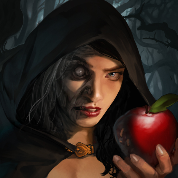
Just in time for Halloween! Oh right…that’s not a costume.
A wise general wins before the battle, while the ignorant general must fight to win - Zhuge Liang
31. October 2018 at 13:31 #23229 kemParticipant
Gorgeous art!
Whould love to have it in 3 stages of transformation as a wallpaper in supporter edition.
1. November 2018 at 16:28 #23231 PsenBattleKeymaster1. November 2018 at 23:09 #23232
 Oh BrotherParticipant
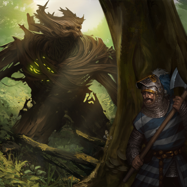
Just a friendly game of hide and seek!
A wise general wins before the battle, while the ignorant general must fight to win - Zhuge Liang
2. November 2018 at 12:18 #23235 juanvalParticipant
The lovely longaxe. My favourite weapon. Come on schrat, let’s play!!
2. November 2018 at 15:34 #23252 DanubianParticipant
Thats some serious chopping power.
Looks like the dude has just the tool he needs for the job :P
2. November 2018 at 16:02 #23254 PsenBattleKeymaster2. November 2018 at 17:49 #23255
 TrappistParticipant
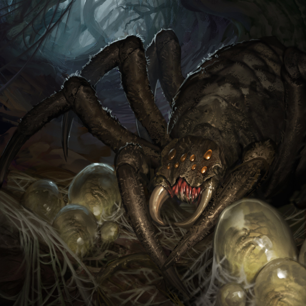
I hate spiders!
…But …..I really want to find a good Taxidermist who can graft those fangs onto my favourite helmet so i get a blinding headbut attack. hehe. Total beast hunter move.
3. November 2018 at 17:21 #23256 ForceEchoParticipant
I think Kraken being a swamp based rather than sea based creature and the design choices are the banner make sense.
One think that irks me and I think from an art point of view could be improved upon is – one of the maritime
based small features in Battle Brothers, the mermaid based company banner ! I was starting a new game recently and
an onlooker that doesn’t play video games watched me create the company. They burst out laughing at the mermaid
banner and said it looked silly. I don’t like to be critical but to be honest I always thought it was a bit immersion
breaking because the quality was pretty poor compared to other banners !"A plethora of peasents"
3. November 2018 at 19:35 #23257 Oh BrotherParticipant
I think Kraken being a swamp based rather than sea based creature and the design choices are the banner make sense.
One think that irks me and I think from an art point of view could be improved upon is – one of the maritime
based small features in Battle Brothers, the mermaid based company banner ! I was starting a new game recently and
an onlooker that doesn’t play video games watched me create the company. They burst out laughing at the mermaid
banner and said it looked silly. I don’t like to be critical but to be honest I always thought it was a bit immersion
breaking because the quality was pretty poor compared to other banners !The mermaid banner would make sense if the plan was to eventually incorporate shipborn combat of some sort into the game. However after seeing the Kraken appear as a swamp boss gives me doubt that any adventure while escorting a trade ship from port to port will happen. Maybe in BB2 will the Kraken find a revised role in the future as the rightful menace of the seas where it belongs, along with sea raiders and drowned undead to challenge your company of brothers, as if getting sea sick wasn’t enough!
A wise general wins before the battle, while the ignorant general must fight to win - Zhuge Liang
4. November 2018 at 01:34 #23258 kemParticipant
Great art!
5. November 2018 at 10:24 #23263 PsenBattleKeymaster
I always thought it was a bit immersion
breaking because the quality was pretty poor compared to other banners !Hey ForceEcho,
thanks for the feedback, I think the design of the banner basically works as there are other banners with similarly crazy emblems. Nevertheless I agree that the quality of the emblem is lackluster. I’ll put it on my “I want to rework” list along with some event illustrations etc.
We’ll see how many reworks I manage to fit into the final release :) -
AuthorPosts
- You must be logged in to reply to this topic.


