Login
Topic: My ideas. (Sorry for my English)
Home › Forums › Battle Brothers: Game Suggestions › My ideas. (Sorry for my English)
- This topic has 17 replies, 13 voices, and was last updated 8 years, 11 months ago by
 Hans.
Hans.
-
AuthorPosts
-
30. August 2016 at 17:17 #16855
 MaximusParticipant
Hello! I have to say, I do not speak English and translate using google translator. I hope you will understand me!
I want to say their ideas. I really like the game. But I think there is not enough information content. In every aspect, in every area. To better understand me, I made pictures.
General Map.

The first idea. I want to show how many days you need the money and provisions. Also, how many need to insturumentov and herbs.
the second idea. Divide the day into sectors to better understand when the end time of the day and another begins. And maybe add a watch.
Third Idea. add the path to the detachment of mercenaries, as I have shown in the picture.
fourth idea. add the ability to put a figure on the overall map of the mercenary group. Any mercenary to choose from.
Screen group.


The first idea. Add button. It shows the general state of the entire detachment of the screen. It is necessary to immediately see the status of the entire group. Are they injured and the condition of their armor. Also, add a button in the menu => Send in the reserve. (If a mercenary in a very bad condition)
The second idea. The menu => Stash icon to add them to the level mercenaries.
Field battle.

The first idea. In the battle, when a lot of people, it is difficult to disassemble their own and others. I propose to make a stroke (outline, aura) for mercenaries, allies and enemies.
The second idea. Divide the total counter. To see the individual allies and mercenaries. (Also, perhaps, for the enemy.)
I have another idea. If you like, I will write more.
30. August 2016 at 20:49 #16860 Harry_KrishnaaParticipant
Need to say… i like each one of your ideas!! a lot of improvements! you realy thought about it.
would be nice to get it as graphical option possibilities. .. so you can use it on own like/need.
Those are most needfull i think (my favorites ;) )
The first idea. Add button. It shows the general state of the entire detachment of the screen. It is necessary to immediately see the status of the entire group. Are they injured and the condition of their armor. Also, add a button in the menu => Send in the reserve. (If a mercenary in a very bad
condition)->The first idea. In the battle, when a lot of people, it is difficult to disassemble their own and others. I propose to make a stroke (outline, aura) for mercenaries, allies and enemies.<-
31. August 2016 at 15:13 #16873 MaximusParticipant
Hello again! I write my ideas yet. I want you to understand me. Therefore, I make pictures.
The first idea. Bandages is good. Bandaged themselves for bleeding is good. But why so greedy mercenaries? Why can not I use a bandage on his friend next to you? Add to use a bandage on the other mercenary!

The second idea. I have a bad memory. I can not remember each mercenary. I begin to fight and one of the mercenaries killed. I want to know who has been killed! What skills have been killed by a mercenary? Add the information button on the dead mercenaries! (after battle).

The third idea. Dogs. I do not control the dog, it is logical. But why I can not specify the purpose of your dog? I want the dog to catch up with the archer! A dog runs after spearman! It is not right. Add the ability to specify the purpose of your dog! This is logical.

The fourth idea. Again the dog. Sometimes you need to return the dog to the owner! (It happens. Rarely.) Let the owner be a dog whistle! The host gives a command and the dog runs to the owner.

The fifth idea. In general I do not understand the map where the battle will be. Close I the enemy? Or I’m away from the enemy? Add the control zone! When they meet, the battle takes place.


Sixth idea. I see the enemy hit points and armor strength. I see your hit points of mercenaries and their strength armor. Why can not I see the strength of the shield? (And their own and others). Add a strip of shield hit points! It is important!

Seventh idea. Add the possibility to place their troops directly to the battlefield! (But not in an ambush) I’m going to (for example, the cemetery), I’m ready for battle! But the troops are at the start of the battle at random! Archers may be ahead, and spearmen behind. Very bad for the win. Images not (difficult to make a picture).
I hope the developers will pay attention to my ideas. Thank you!
31. August 2016 at 15:34 #16875 RusBearParticipant
Even a little jealous – so much enthusiasm and a serious approach to the proposals. I think I even know the author). It is a pity that so little time before the release…
But let a little optimistic!
100 % I support all the suggestions.31. August 2016 at 16:21 #16879 WillsamaParticipant
Maximus, i don’t know what language you speak but:
merci/gracias/thanks/obrigado/danke!
great ideas!31. August 2016 at 16:36 #16880 AnonymousInactive
Absolutely! Willsama and I just had a chat about your ideas and I forwarded the thread to Overhype. Let’s see if some of your ideas might be implemented (despite of the usual restrictions of time and ressources).
31. August 2016 at 23:31 #16888 icemelonParticipant
Nice job man, for the suggestions and the time you took to make the images. I support everye each of one of them.
1. September 2016 at 10:58 #16899 JaysenKeymaster
Hey there,
thanks a lot for all the thought out suggestions!
Many of your points go in the direction of increasing usability and the availability of information. We agree that there is a lot of room for improvment in that area, for example fixable tooltips on enemies so you can see the effects of their injuries.
However, we will do improvments like those a bit further down the road. Firstly, we want to focus on the general gameplay and on getting more content into the game.Anyways, really good points made by you here and we took some notes!
16. September 2016 at 10:05 #17302 MaximusParticipant
Hello everybody! It is me again. I have new ideas (and more pictures). I hope you will enjoy.
The first idea. In order to assess the tactical battlefield, you need to see impassable areas. Add a button.

The second idea. The band sequence of moves little. It is difficult to build a battle strategy. You need to add the numbers to the mercenaries and enemies (running line). Also show digit phase of the round. (All in the picture).

The third idea. Show on the battlefield chance to hit the enemy.

The fourth idea. Change the inventory interface during the battle. (Difficult to describe. Shown in the picture)

The fifth idea. Add a button to the end of the tour for all of their mercenaries!
 16. March 2017 at 10:30 #20568
 MaximusParticipant
It’s me again, my bad English and my good pictures! I was waiting for the last update to see how the game changed. I have some disappointments. And new ideas for improving the game!
I sometimes get the feeling that the developers, through an uncomfortable interface, want to show us the whole burden of the life of a medieval mercenary. (A joke, but I really think the interface of the game is very uncomfortable).
To previous ideas, I add my new ones! Players, give me feedback, do you agree with my ideas?
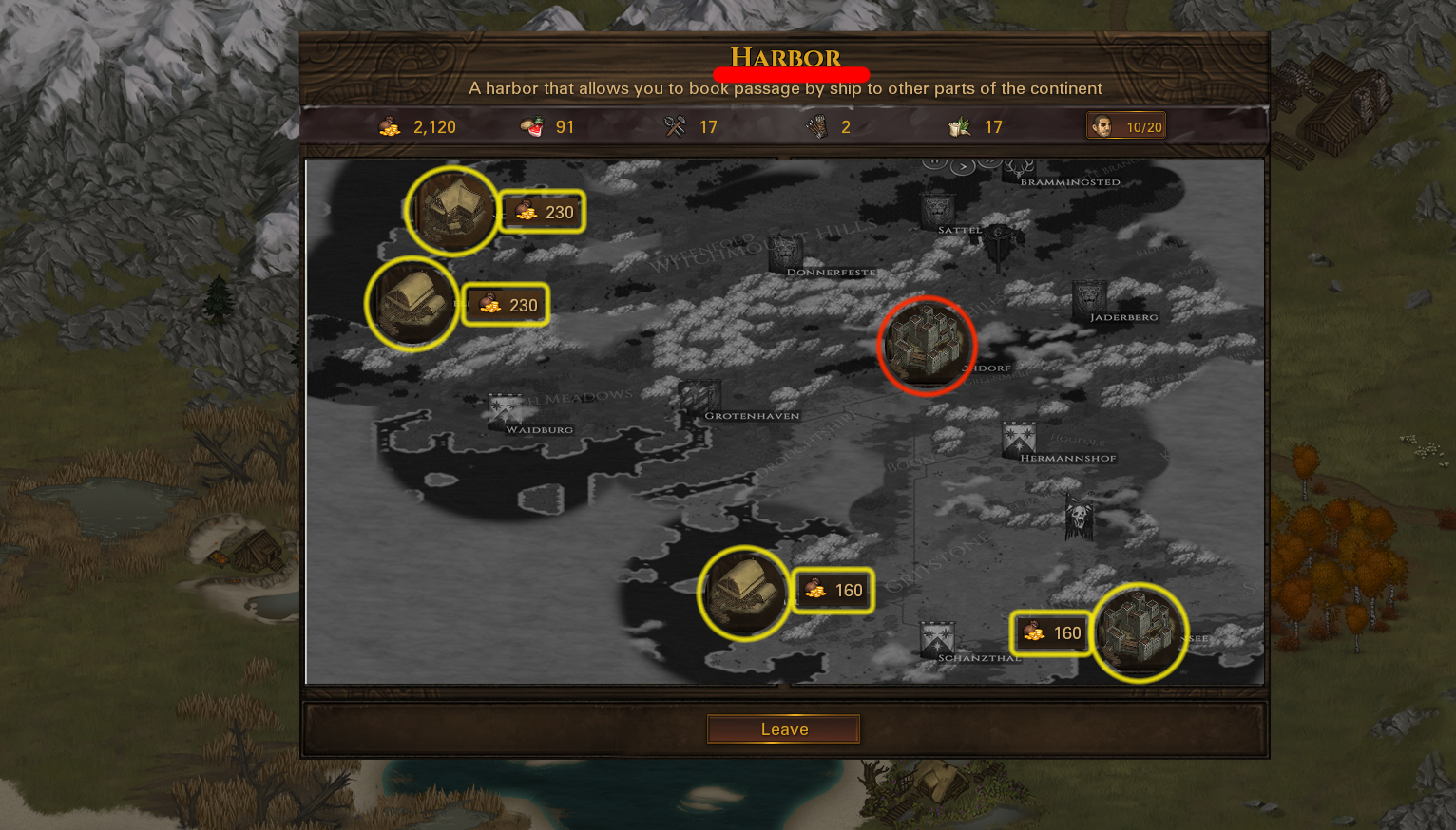
1. I find the harbor screen uncomfortable. In order to know where I can go I need: Close the harbor window => Close the city window => Dismount the map to the maximum => Examine => Open the city window => Open the harbor window. Lots of action!
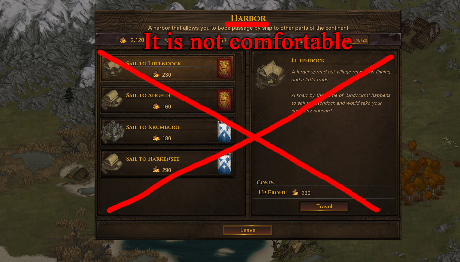
I propose to enter a mini map directly into the harbor window. This map graphically shows the places where I can sail. All very clearly and conveniently.
2. To the previous idea. Also, I suggest adding a map button to the contracts.
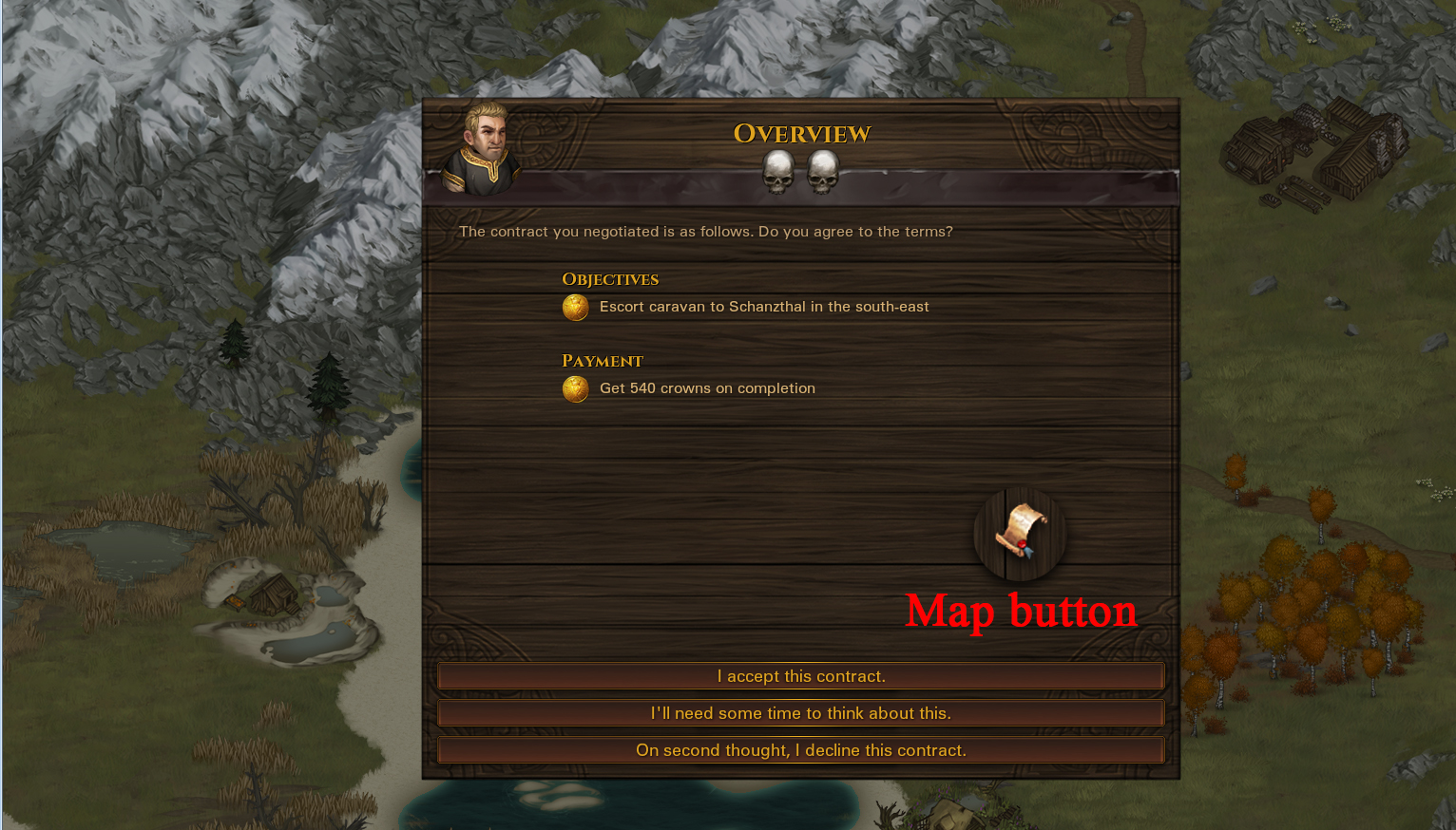
Not all contracts will support this button. Only such contracts that can accurately indicate the final location. For example, deliver cargo. Having looked at the map, it is easy to understand whether to go far or near without unnecessary actions.
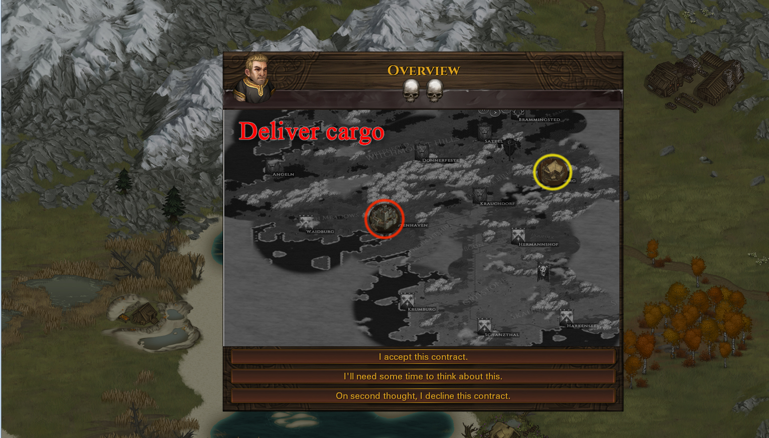
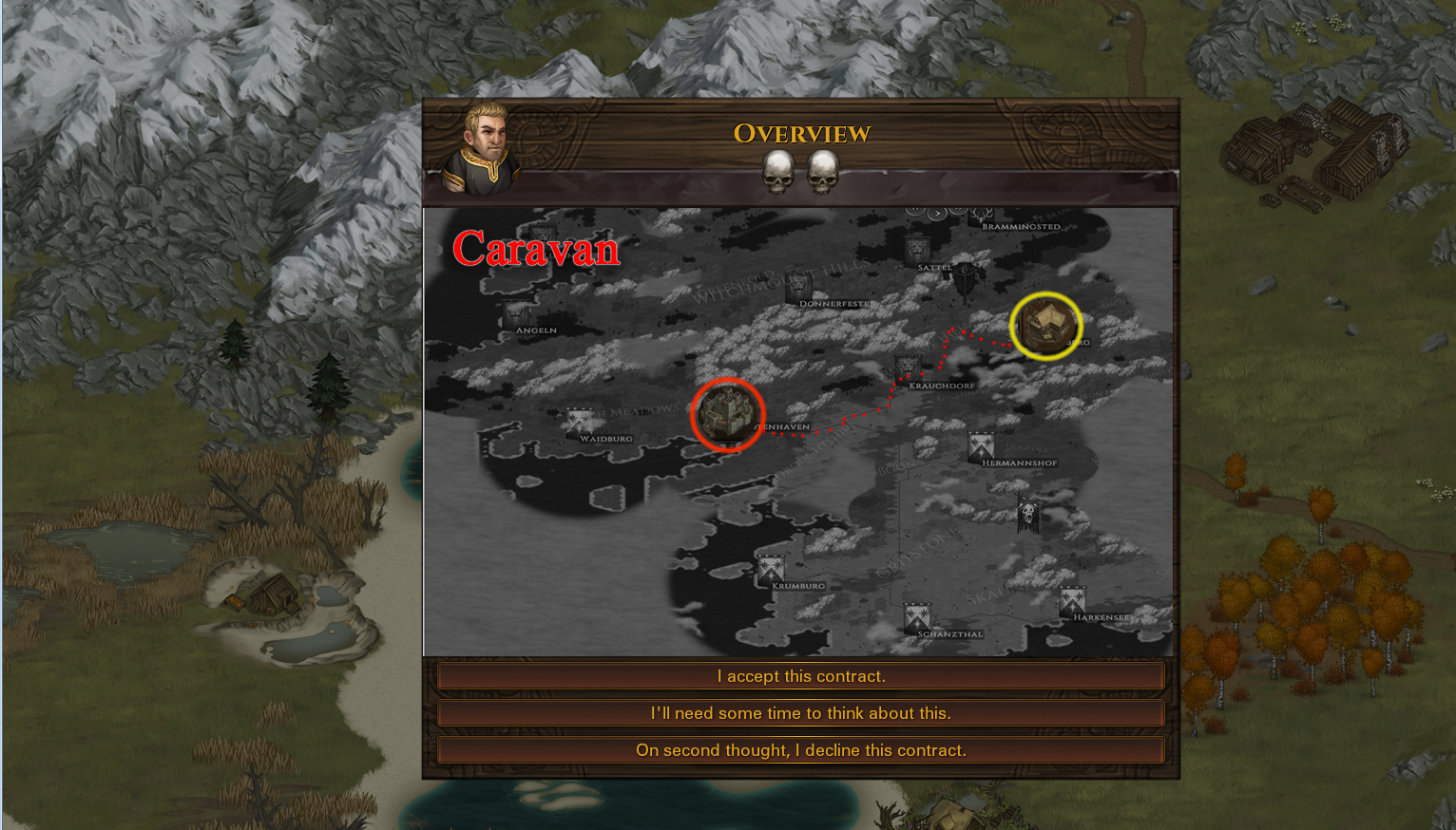
Also, contracts that support such a button must necessarily include contracts with the caravan. And the map will mark the way on the road, so it was clear how far along the road to go (in fact caravans go only on the roads). Perhaps even need to specify the length of the road.
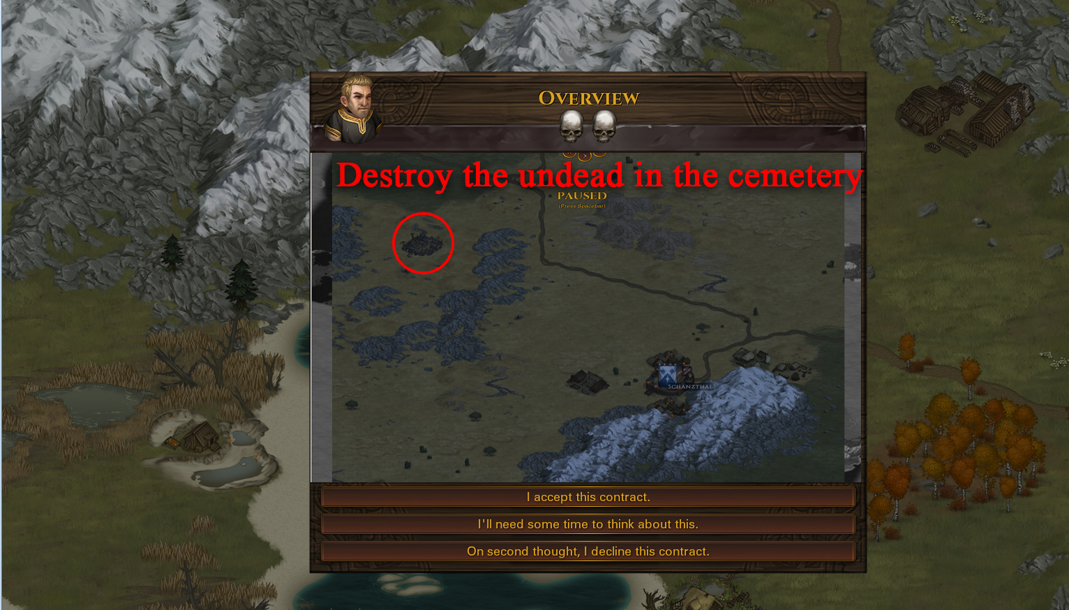
When we conclude a contract for the destruction of the undead in a cemetery or the destruction of a bandit base, we do not see how far the final destination is. The final point of the contract is obtained only after we have accepted the contract. And the end point can be very, very far. (I have a question in such cases: how can a very remote cemetery affect this village?) Let there is a button with a map for such contracts!
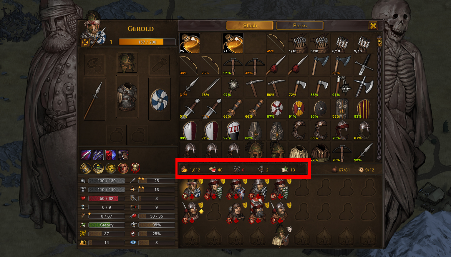
3.Inventory of the group. We all know the inventory of the band. When I’m in the inventory of a group, I have a question: Why do not I see my money, instruments, medical preparations in the things of the ALL GROUP? Why should I close the group window and on the general map only see it all? I think this is very not logical and uncomfortable!
4. Additional things. Bandages, antidote, dogs, falcons. You can find them in the inventory of the group and drag them into the pocket of the mercenary. But, I propose to make it more convenient. I propose to make a button with an opening list instead of a mercenary pocket. Clicking on the button, we can see that we have at the moment and the number of dogs, bandages, antidotes and falcons.

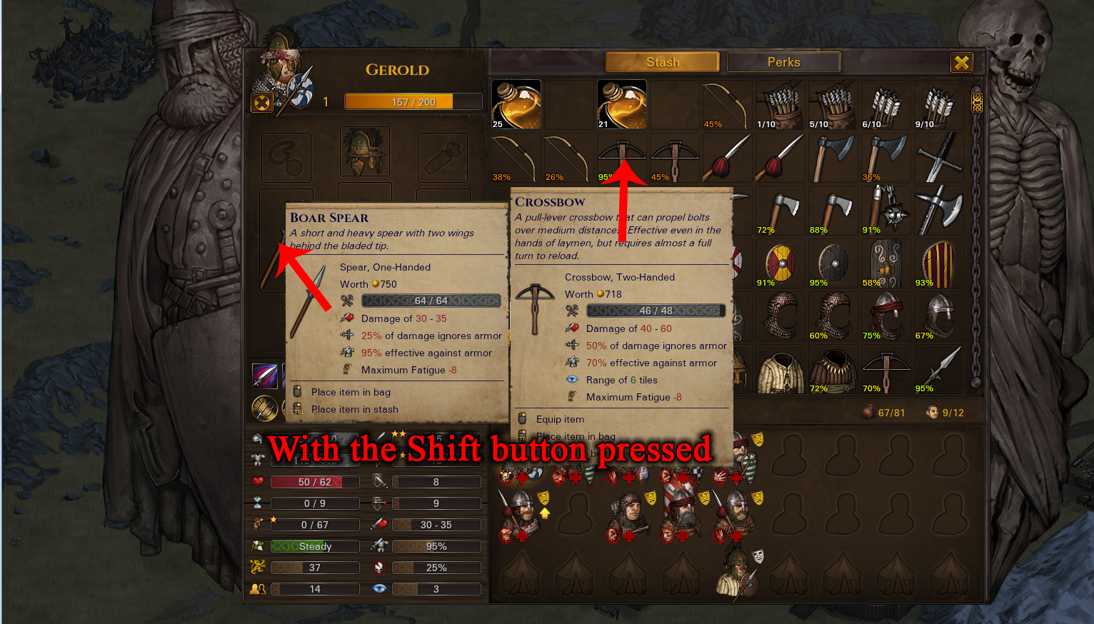
5. Comparison of subjects. We found a new thing (or bought a new thing). Is this ax better than the one the mercenary wears? It’s embarrassing to put the cursor on things to compare them! I suggest to enter a comparison of objects on the shift button. Compare the thing imposed on the mercenary and the thing under the cursor.
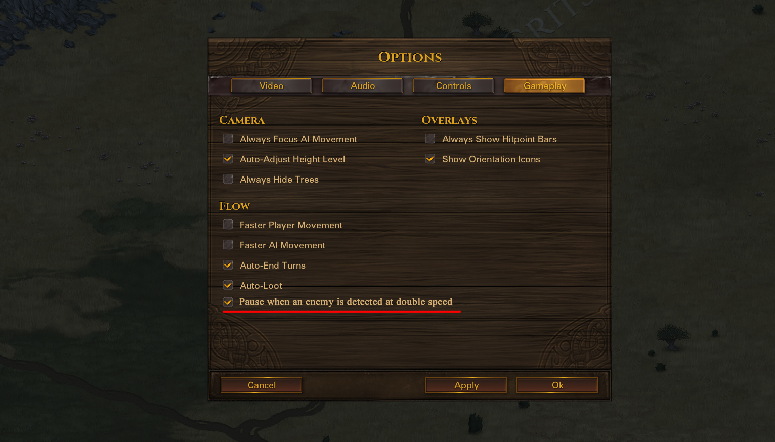
6.Double speed. This is good and bad. Will explain. We go fast in the area, but enemies also go twice as fast! The sound signal when an enemy is detected is good. But I do not have time to press a pause before the collision with the enemy, because everything goes quickly! I propose to make an option that puts the game on a pause when we see the enemy. I want to have time to react!
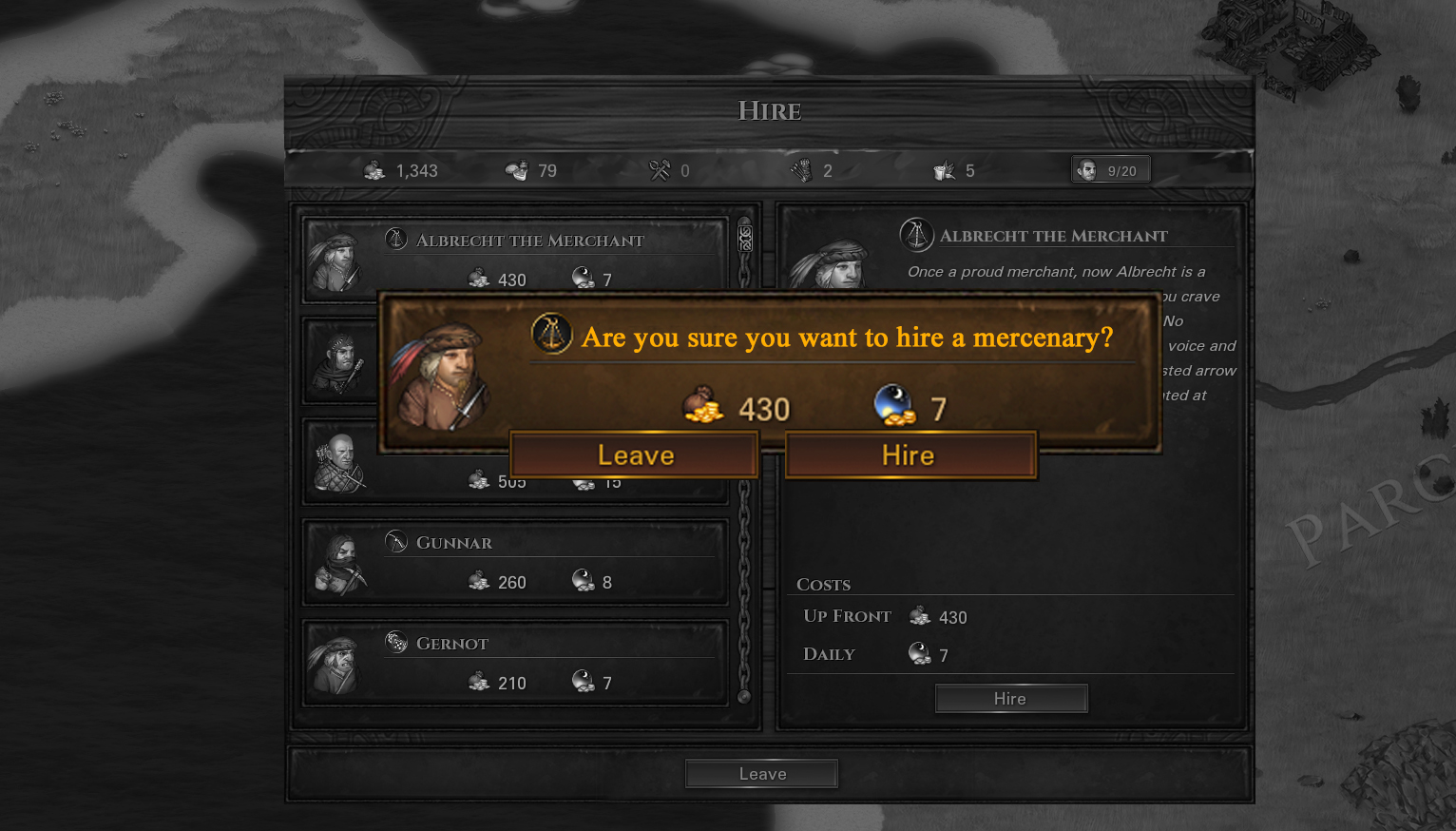
7. Add a confirmation window for the purchase of a mercenary. Maybe I think for a long time. Maybe I pressed the button hard. Sometimes I buy two mercenaries instead of one! I do not need it! Add a confirmation window for buying a mercenary so I do not buy an extra mercenary. There is so little money to buy what is not needed.
These are all the ideas that I remembered, but I think there will be new ideas. I hope for a feedback! Thank you!
16. March 2017 at 11:17 #20569 RusBearParticipant
Right now you can not even put a bandage from your pocket in the active slot if there is a dog or a falcon. This is extremely inconvenient.
Of course, I personally “yes” for all of your proposals, some of them have long been discussed. I’m afraid that we’ll see all this only by mods if there will be mods support.16. March 2017 at 11:37 #20570 MaximusParticipant
I, unfortunately, can not know what ideas have already been proposed in the past. So I’m sorry for the repetitions. I still hope that the developers will improve the interface before the release. Still have a little time.
17. March 2017 at 04:47 #20599 NamespaceParticipant
Wow… So much time and effort spent on this!
Generally, having the game pause when an enemy comes in sight would be a great addition. I sometimes go to the kitchen and get coffee while my company is travelling to the next settlement. Same with caravan escorts.
All of your suggestions look great! +117. March 2017 at 12:56 #20607 mrbunnybanParticipant
Whoa, these are really good! I’m a little sad you didn’t come here to provide feedback earlier Maximus.
17. March 2017 at 17:03 #20610 SarissofoiParticipant
Good job.
Really like all of this.BTW Any chance on separate sliders for battle effects(hits, shields breaking, armor hits etc) and voices(goblins, undeads etc?)
-
AuthorPosts
- You must be logged in to reply to this topic.
