
Login
Topic: Suggestions (with pictures)
Home › Forums › Battle Brothers: Game Suggestions › Suggestions (with pictures)
- This topic has 8 replies, 4 voices, and was last updated 9 years, 5 months ago by
 Dumbo.
-
AuthorPosts
-
26. January 2017 at 05:37 #18961
 RahzielParticipant
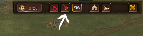
After looking at this image from a recent DevBlog I was compelled to object regarding several things and plunged in creating illustrations for it to show my vision of the improvements for the game..
This is what was created in the end and what came out of it, surprising even myself.

So I can proudly declare: Overhype, you inspire people!
But let’s look closer at it step by step in an a proper order:
1. Camera Zoom & Lock in 1 button
No need to waste valuable space with additional button where functionality of both could be in one single button. Like this:
– Left Click to Center & Zoom
– Right Click to lock/unlock camera on your party with icon reflecting the current state

2. Contract Show/Hide button
Much needed and often asked by many: the ability to minimise the Contract.
And no need to draw anything new – using the old assets here this is how it looks:


3. Reworked Factions & Relations icon
Because, a ‘paper and quill’ drawn in a way that it’s hard to make out what’s there unless one stares intently, and thematically it have no meaningful portrayal of the Factions or Relations. Even laurel wreath from Renown would suit it better. Or how about this lame Photoshop attempt:

4. Remove the Zoom in animation when opening Faction & Relations screen
It’s totally unneeded, since it doesn’t zoom in on party or anything – it just does for the heck of it. And on slow computers it only serve to delay and annoy..
This one don’t deserve a picture.5. Towns icons in Relations list
Not just lame banner each settlement have regardless of faction allegiance.
Harbor screen already have it, and every screen uses same template, so why not use it here too?
Allow us discern at a glance who we’re dealing with. Also, some additional info about settlements could be added..

6. Information & Rumors ( mostly rumors )
Because we need one! Trying to remember all the useful rumors or writing them down by hand on a piece of paper is not a good way to utilize such a cool feature.
If it would be possible to ‘write down’ only useful info without the fluff text then it would become priceless.
Button with tooltip –

This is how it works: In a tavern you hear a rumor which seems useful to you – Write it down!

When you open your collection of rumors you’ll see something like this:
– Separated by the settlement where you heard it and the day when it happened.
If the rumor is confirmed to be false or you already went through it – delete it.
7. Buy-Sell price in tooltip
Because sometimes the current price on the item’s icon is not clearly visible –

Adding price to the tooltip makes sure noone misreads it; besides, we have a free space there which we can efficiently use.

8. Current LVL of Bros in post-battle screen
For ones who died too! If howering cursor on the icon would bring up info about stats it would be perfect.

So no more trying to remember who was that headless corpse and what he aimed to become.
Though this suggection could be solved in a completely different way with introduction of obituary..
26. January 2017 at 09:36 #18963 Ned StarkParticipant
I’d agree, some very needed, and some easy to fix improvements are mentioned here.
I think I can honestly only add one suggestion.
7. Buy-Sell price in tooltip
Because sometimes the current price on the item’s icon is not clearly visible –
Adding price to the tooltip makes sure noone misreads it; besides, we have a free space there which we can efficiently use.
If there was an addition of a shaded box behind the yellow (or white could be used) digits of what an item cost, then you wouldn’t need to hover over it to read it clearly in the first place.
8. Current LVL of Bros in post-battle screen
…
Though this suggestion could be solved in a completely different way with introduction of obituary..
I do believe I’ve read somewhere that there was going to be the addition of a “Memorial”. A place where you can view the stats of your best fighters. Though, I admit, I would like knowing on the spot who exactly that it was that is now missing their head.
"It is not death that a man should fear, but he should fear never beginning to live." ~Marcus Aurelius
Game: "Characters with a height advantage against their opponents are harder to hit"
Me: "That's not true, and my short axeman is living proof!"26. January 2017 at 12:21 #18967RahzielParticipantForgot to add a must-have utility function:
6. Information & Rumors
– when new rumor is added to the log book the town it belongs to should be moved to the top of the list, so you don’t have to sift through all available entries. That way the most fresh & relevant rumors are being kept in orderly fashion, and the older ones are sinking down.
Also,
same could be applied in “5. Factions & Relations” list of settlements bringing to the top the ones which received reputation changes (positive or negative).Next is the new (rather old) addition taken from the thread “Make footprints more visible“:
9. Footprints color switch

It could be preset colors (white-black-red to save dev.time) or something in the options menu to set a custom color.
26. January 2017 at 16:27 #18970 WargasmParticipant
Footprints already switch between lighter and darker shades depending on the shade of the terrain; the main problem, I think, is that they’re too small to be visible on some terrain types (despite clear visibility and colour distinction at a close zoom) once you’re sufficiently zoomed out. If footprints shrunk to a lesser degree than the rest of the terrain when you zoomed out, that might make them always okay.
28. January 2017 at 08:08 #18998RahzielParticipant10. Improved look of Obituary
Because too much space is wasted, when a lot more information could be displayed.
Because the already existing assets could be reused.
Because icons are a lot more intuitive and transcend the language barriers (also help with translation: no need to adjust width or worry something might not fit).
If naming and more elaborate explanation for Icons is needed – the tooltips will save the day!

Edit: Damn, only after I posted pics did I realise there is no space for scrollbar.. T_T
29. January 2017 at 06:14 #19011Ned StarkParticipantNumber 9. I believe has been addressed a day after your post, so, in case you missed it by chance:
The next update uses a different color for footprints and has contract-related footprints stand out a bit.
The obituary could use more information like this. If you’d remove one column for the scrollbar, I think it’d be “losses”, as losses might be miscounted anyway when a mercenary falls on the field of battle but is found alive after that battle. Well, unless one would count that battle as a victory for that mercenary, even though they spent some time facedown in the blood and mud.
"It is not death that a man should fear, but he should fear never beginning to live." ~Marcus Aurelius
Game: "Characters with a height advantage against their opponents are harder to hit"
Me: "That's not true, and my short axeman is living proof!"30. January 2017 at 06:36 #19033RahzielParticipantThe “Battle Lost” counted not at the time a mercenary falls, but when the company (what’s left of it) retreats from the battle.. Those who survived have their counter increased.
For the thing you mentioned the list needs the “Number of times Died(revived)” column.Improved a bit the Obituary screen, added column separators and the mercenary’s level and recruitment payment columns.
Font size and leading decreased by one notch to fit all the things. 3. February 2017 at 02:57 #19094RahzielParticipant
Added backgrounds icons resized and cropped (they look a bit squished) – how does it look? Are they recognizable?
 3. February 2017 at 03:40 #19095
 DumboParticipant
Yeah, it looks really nice.
Ayy Lmao
-
AuthorPosts
- You must be logged in to reply to this topic.