Login
Topic: Paul´s Art Corner
Home › Forums › Battle Brothers: Game Discussion & Feedback › Paul´s Art Corner
Tagged: buy
- This topic has 1,776 replies, 176 voices, and was last updated 1 year ago by
 niirproject.
-
AuthorPosts
-
3. February 2019 at 11:28 #24077
 IociParticipant
Feeed us, Paul, fiilll our hunger!!!
4. February 2019 at 13:52 #24080 PsenBattleKeymaster
Hey guys,
can’t show you too much yet. I already did quite a bit of work, but I don’t want to show stuff that might not end up in the game.
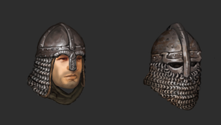
Here are the two new helmets as shown on the artwork. Bear in mind these are just normal helmets, not named ones.Cheers!
 4. February 2019 at 14:32 #24082
 juanvalParticipant
The left one is very interesting. The right one is fearsome. Thanks Paul for sharing your work!!!
6. February 2019 at 17:07 #24092 MarsdreamerParticipant
I was looking through some of the old artwork you did back in the beta. It’s incredible how far the game has come and really cool to see your progression from early mockups to finally nailing down the theme in your design.
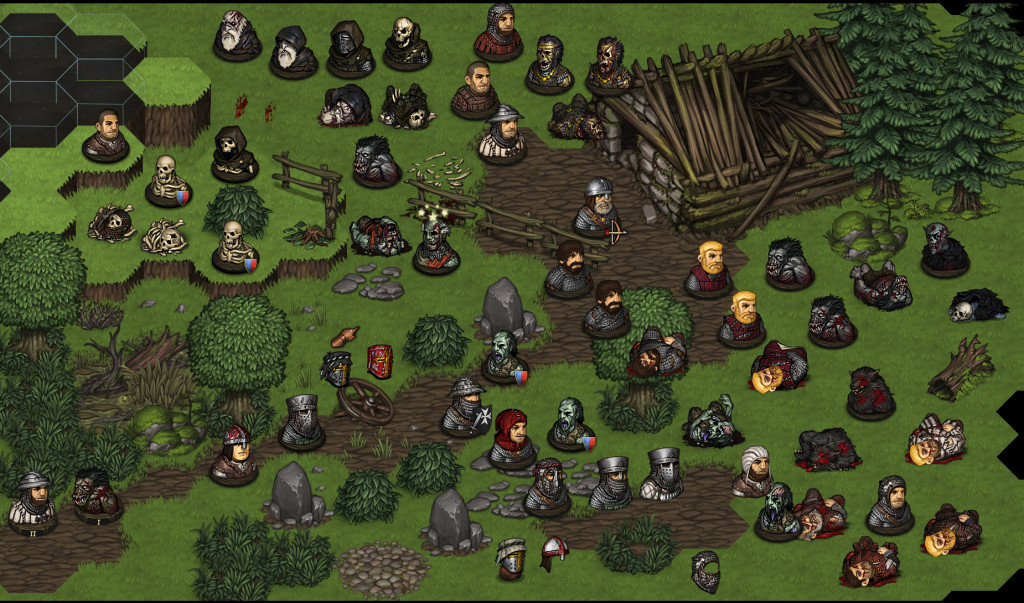
I also stumbled across this old mockup. Whatever happened to adding in structures to the battlemaps? Too complicated? Did the tile system break the ability to add multi-tile structures?
 6. February 2019 at 19:05 #24093
 laViperParticipant
Hi Paul, I hope it doesn’t not looking as arrogating, but do you have some icons/images which haven’t been used in current DLC and which you don’t plan to use in new DLC? It could help with modding cause icons from another games aren’t suitable.
7. February 2019 at 12:16 #24097 PsenBattleKeymaster
I also stumbled across this old mockup.
Old? I was barely born when this was made :)
We put quite a bit of time in exploring the whole Buildings on the combat map issue. The thing is it turned out to be really tricky to implement multi-tile objects with our engine (2D, height levels, hex tiles etc).
Our last attempt looked like this:

We had to cut the objects, so that no element is wider than one tile and then piece them back together in the combat map. It was a hassle :( So we finally decided that our time is spent a lot better on improving the gameplay and adding content instead of finding a dodgy workaround to implement large structures.
Apart from the technical issues, the gameplay effect of large objects would be very doubtful as they would basically just clog the map without adding any strategic depth (even though of course they would look pretty cool).7. February 2019 at 12:20 #24098 PsenBattleKeymaster
Hi Paul, I hope it doesn’t not looking as arrogating, but do you have some icons/images which haven’t been used in current DLC and which you don’t plan to use in new DLC? It could help with modding cause icons from another games aren’t suitable.
What kind of icons are you looking for? Active skills? Backgrounds or something like that?
The thing is that there are very few leftover icons as I tend to rework the old ones instead of creating new ones.
Nevertheless, if you let me know what exactly you’re looking for I still might be able to help you out.7. February 2019 at 16:06 #24099 YetAnotherFoolParticipant
Hi Paul,
regarding hex tiles being not suitable for structures that block – Have you thought about hex tiles that simulate dangerous depth? Like tiles for canyons, holes, and so on.
I guess it definitely would add something to the game to shield bash enemies into a pit. A large structure that could help this feel would be a bridge.
Cheers, looking forward to more (very old player that is returning with the latest great news of the DLCs!!! Keep em coming!)
7. February 2019 at 18:39 #24102 laViperParticipant
What kind of icons are you looking for? Active skills? Backgrounds or something like that?
I think consumable items like potions,
but as i see, each needs 2-4 images – one 70×70 for stash, second for battle 56×56 (with greyscale). And may be extra one for status (also 56×56 but in cicrle) or even two like Spider/Goblin Poison.
For settlement events or backgrounds you also use 56×56 in circle, so I can reuse perks/skills images for it.Also want to ask – what is your (mean all team) attitude to mods? I know that now mods mostly break balance like 20 bros in battle or making super-stats brother. But if some mods were good enough, would you have plan to include it into game?
I guess it definitely would add something to the game to shield bash enemies into a pit
May be just increase damage from current falling, making it depend on max HP of target.
8. February 2019 at 13:05 #24115 juanvalParticipant
I’m not a fan of obstacles in the middle of battle. AI in games is generally poor, an this is worse when there are obstacles.
On the other hand, I’m very happy with Battlebrothers AI. I’ve played more than 1.000 combats and I never get tired :)
I’d like to see human enemies moving through battle area in a more coordinated way as ancient legionaries do (Shield legionaries on the front and Pike legionaries on the rear), instead of moving scattered.
9. February 2019 at 08:32 #24130 MarsdreamerParticipant
We had to cut the objects, so that no element is wider than one tile and then piece them back together in the combat map. It was a hassle :( So we finally decided that our time is spent a lot better on improving the gameplay and adding content instead of finding a dodgy workaround to implement large structures.
Apart from the technical issues, the gameplay effect of large objects would be very doubtful as they would basically just clog the map without adding any strategic depth (even though of course they would look pretty cool).That makes sense and was about what I figured. Thematically I feel like it would be very cool, especially (at least) for some Legendary Location fights as a means to kind of make them unique and be a kind of set-piece. I’m sure it would basically be useless in battle, but part of me loves the idea of just a little bit of terrain to marry the battle map with the location piece. Just some structure or remnant of one off in a corner of the map, barely visible (from the start battle view) and out of the way, but enough to make you remember “Ah, this is some dilapidated farm” or a few gravestones and dug-up graves for a graveyard. Little things — But I’m sure that it’s a lot of work for only thematic benefits.
Cheers, and thanks for the response. Can’t wait to see your artwork posts for what you’ve been working on with the new DLC :)
10. February 2019 at 04:01 #24133 AnonymousInactive
We had to cut the objects, so that no element is wider than one tile and then piece them back together in the combat map. It was a hassle :( So we finally decided that our time is spent a lot better on improving the gameplay and adding content instead of finding a dodgy workaround to implement large structures.
Apart from the technical issues, the gameplay effect of large objects would be very doubtful as they would basically just clog the map without adding any strategic depth (even though of course they would look pretty cool).I totally understand why the buildings were cut. I would however love more map variety. Graveyards with single hex grave stones, orc/brigand encampments with barrels and boxs (and wood floors to boot), etc etc. I still think map variety can be achieved without having to introduced big(multi-hex) buildings and structures.
10. February 2019 at 16:58 #24136 ForceEchoParticipant
If you get a chance Paul check out my suggestion thread on suggestions section, it is a little long but I thought hard about them ! Love the new helmets, Cheers :)
"A plethora of peasents"
11. February 2019 at 10:31 #24137 PsenBattleKeymaster
I totally understand why the buildings were cut. I would however love more map variety. Graveyards with single hex grave stones, orc/brigand encampments with barrels and boxs (and wood floors to boot), etc etc. I still think map variety can be achieved without having to introduced big(multi-hex) buildings and structures.
I agree, but we just never found the time to implement it. You always have to choose between adding this or adding new content/game mechanics. It’s a tough choice sometimes….
If you get a chance Paul check out my suggestion thread on suggestions section, it is a little long but I thought hard about them ! Love the new helmets, Cheers :)
Hey, I really appreciate the effort, but I try to stick to art related topics as much as possible in here :) Even though I myself deviate from time to time ….
Please have some more patience, as I am trying to find some new art which I can post without spoiling stuff…
11. February 2019 at 13:23 #24139 AnonymousInactive
Hey Paul!
Would you share a high resolution image of the Orc Man Splitter? I’m working on a mod to add a Named version of the latter as well as Named Undead weapons. I have no drawing skills so I figured I’d reuse your models and make some recoloring and patchworks. For Undead weapons, I found an image there: http://battlebrothersgame.com/dev-blog-85-ancient-dead-part/. It already has a good resolution. For the Man Splitter, the art book has one but it’s fuzzy around the edges. -
AuthorPosts
- You must be logged in to reply to this topic.
