Login
Topic: Paul´s Art Corner
Home › Forums › Battle Brothers: Game Discussion & Feedback › Paul´s Art Corner
Tagged: Universal Mod at Battle Brothers
- This topic has 1,776 replies, 176 voices, and was last updated 10 months, 2 weeks ago by
 niirproject.
-
AuthorPosts
-
20. November 2015 at 16:24 #7445
 Holy.DeathParticipant
Looks like the next update I will dedicate my Battle Brothers to protection of vital mining and metallurgy operations to prevent them falling into enemy hands.
22. November 2015 at 00:23 #7452 OldGreyBeardParticipant
Exactly, now you can have a look at the worldmap and already estimate what will be offered in that settlement. If you are looking for weapons and armor visit towns with surface ore veins, smelters and furnaces attached.
Fantastic artwork, as usual. I think the style is perfect for the setting. The idea that a city near a mine will have a better selection of weapons is great.
One thing I like about the game now is that all prices to the company is retail. There’s no incentive to carry inventory to trade. That might make things interesting, but overall, not accurate. Of course, it would be a distraction to running a company, so be sure to not let it creep in!
In a single player game, there's no such thing as cheating. It's merely "creative manipulation of the default settings"!
28. November 2015 at 14:13 #7864 JeuparfoisParticipant
I really dig the art design of this game. Solid, immersive.
I have but one slight restraint about it, if I may.
About the base (stand, plinth, I quite don’t know the exact word obviously) it works wonder with skeletons and golbins, due to their smaller size, great with big orks, and their armoire build.
Althought, with humans, it feels a bit less like pawns, a bit more “eggish”. As the left side embraces the bottom, the character tends to be seen as a whole, and not over his base. Maybe a larger base than top would be more pleasant, truly my opinion.I hope it’s not inconsiderate to permit myself the remark.
As besides this, art direction is flawless to me, full of spirit and seriousness.Keep up the good work.
28. November 2015 at 17:06 #7865 Asterix_von_TWCParticipant
Paul? The last preview has some really wonderful imagery in the background of the title… could you post some more of those buldings/people?
Thx :)
2. December 2015 at 11:19 #8668 PsenBattleKeymaster2. December 2015 at 11:24 #8670
 PsenBattleKeymaster
could you post some more of those buldings/people?
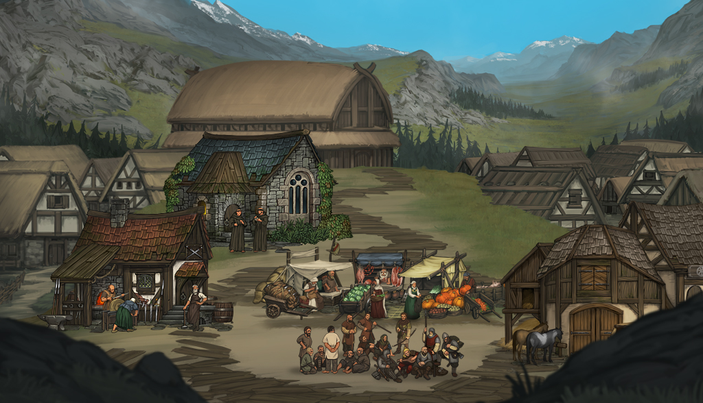
How about a small mountain village?
 2. December 2015 at 17:39 #8687
 Asterix_von_TWCParticipant
This is a genuine improvement over something that was already good! I love the backgroumd, and the “cosy” feeling of the village. The bands of people are interesting and appealing… this feels a lot more like a town than the previous art! Well done. Isn’t the lighting on the vegetables a bit too bright though?
4. December 2015 at 16:33 #8996 WillsamaParticipant
Great job, as always. I almost hear the tchating of the men on the foreground, slightly covered by the sound of the wooden wheel! :)
13. December 2015 at 17:43 #11035 scarynedParticipant
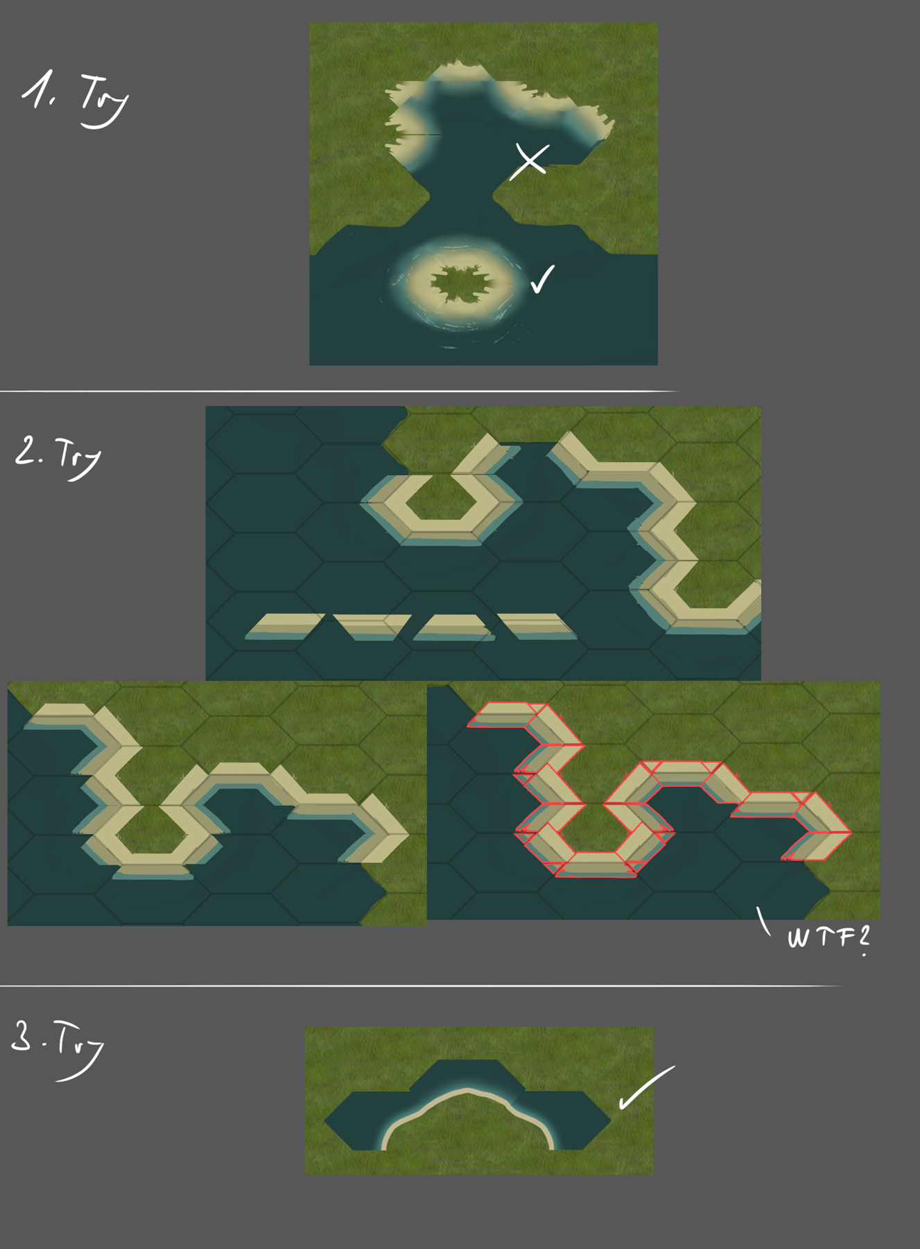
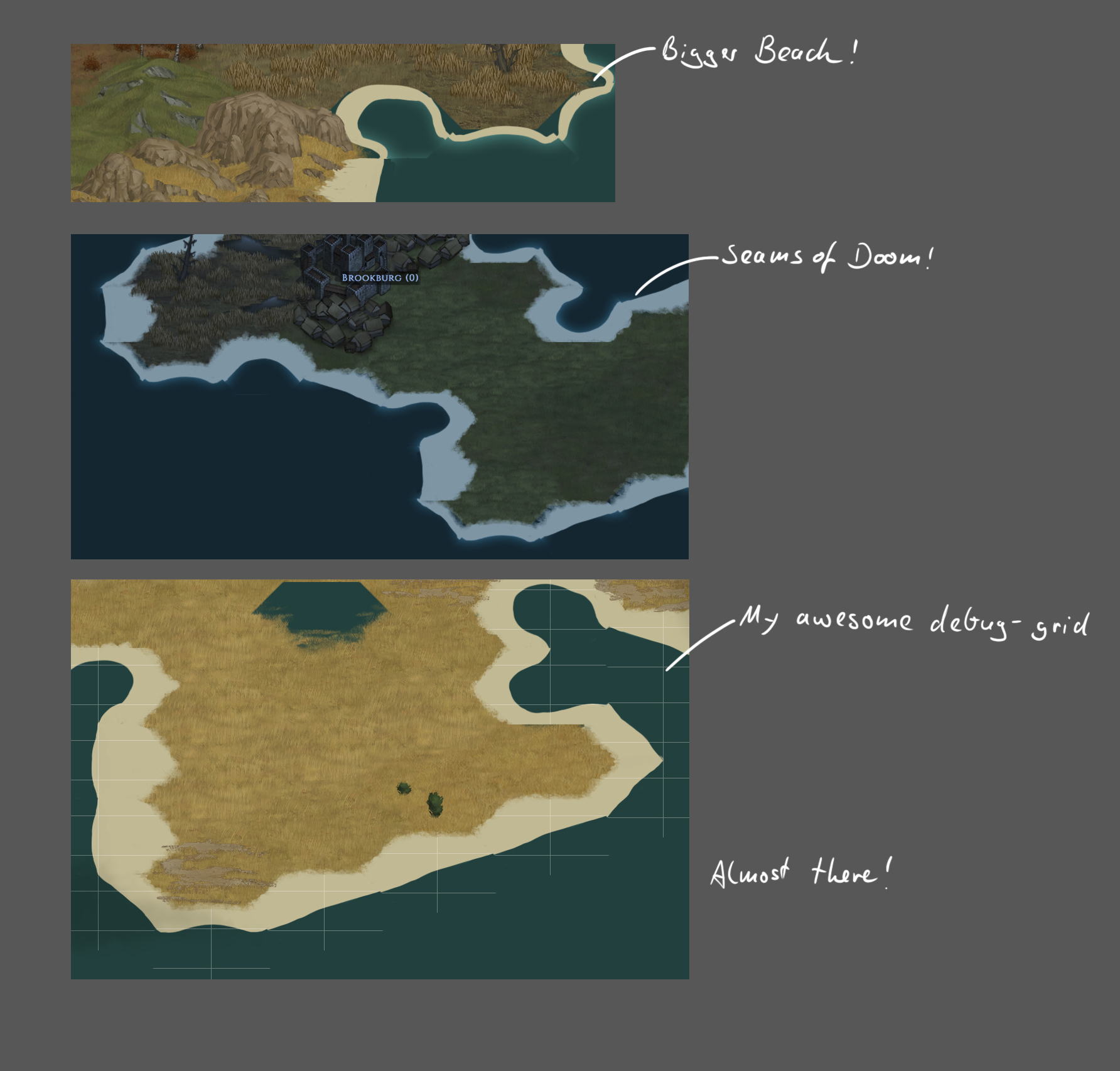
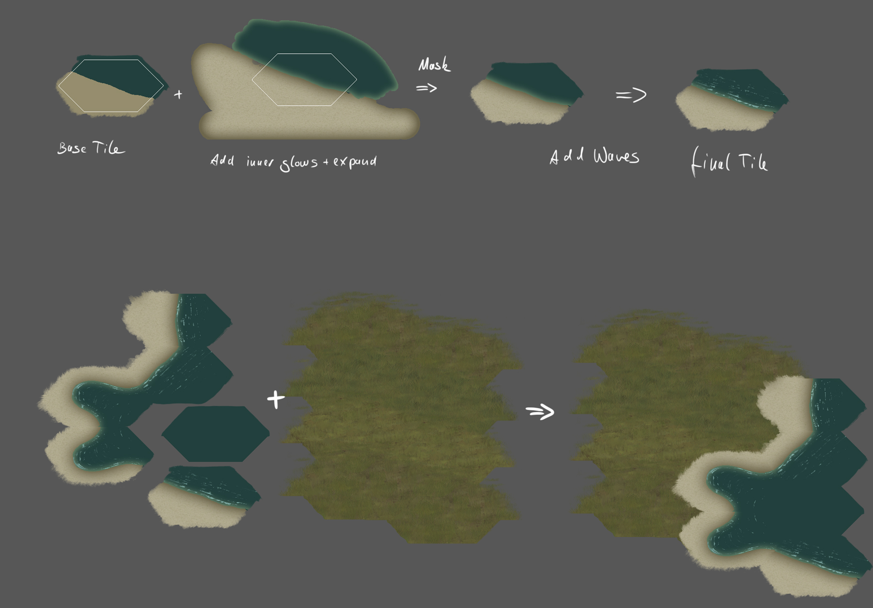
Dude! how did you make the shoreline so smooth on a grid based, pre drawn and randomized map?? with the Dec 11 update, your shoreline is just really well done. how did you layer it? water then sand then grassland? or sand then water then grass? I really can’t tell, but I’d like to know how you blend all the shore tiles in your art corner.
RL
14. December 2015 at 11:13 #11469 PsenBattleKeymaster
I almost hear the tchating of the men on the foreground, slightly covered by the sound of the wooden wheel! :)
As we speak we are creating a beautiful set of ambient sounds for all villages, depending on the buildings etc.
14. December 2015 at 11:47 #11472 PsenBattleKeymaster14. December 2015 at 11:48 #11475
 PsenBattleKeymaster14. December 2015 at 11:49 #11476
 PsenBattleKeymaster16. December 2015 at 09:16 #11627
 OldGreyBeardParticipant
Wow! Paul, thanks for the insight into the shoreline development. I think the results speak for themselves. Can’t wait to see this in the game!
(… are you sure you can’t squeeze a skunk into the merc banners? ;-) )
In a single player game, there's no such thing as cheating. It's merely "creative manipulation of the default settings"!
16. December 2015 at 11:43 #11629 PsenBattleKeymaster
(… are you sure you can’t squeeze a skunk into the merc banners? ? )
Now is the time to influence me :) I have not yet decided how the final mercenary banners will look like. In my mind I am exploring various styles. They have to sport a clearly distinct look compared to the noble house banners, but nevertheless should look authentical and in period.
So if you have any concrete suggestions to push me this way or another, just go :)
-
AuthorPosts
- You must be logged in to reply to this topic.


