Login
Topic: Paul´s Art Corner
Home › Forums › Battle Brothers: Game Discussion & Feedback › Paul´s Art Corner
Tagged: buy
- This topic has 1,776 replies, 176 voices, and was last updated 1 year ago by
 niirproject.
-
AuthorPosts
-
4. May 2015 at 10:06 #2896
 PsenBattleKeymaster
Hi Trig,
all these Banners were created using our future banner customization tool wich players will be using when starting a new game.
They consist of the following parts:
Banner shape, Base color, Pattern Color, Main emblem, secondary emblem.
All Emblems have to be combinable with all banner shapes and with all color patterns, otherwise a lot of work will go to waste when painting special emblems which work only in combination with certain color patterns.
Of course these banners dont look as intriguing and as authentic as if i had painted them by hand.When I start working on the final Banner generator I’ll consider your points and maybe change some of the set up to allow for more authentic combinations.
Cheers!
4. May 2015 at 10:12 #2898 PsenBattleKeymaster
And now for something completely different:
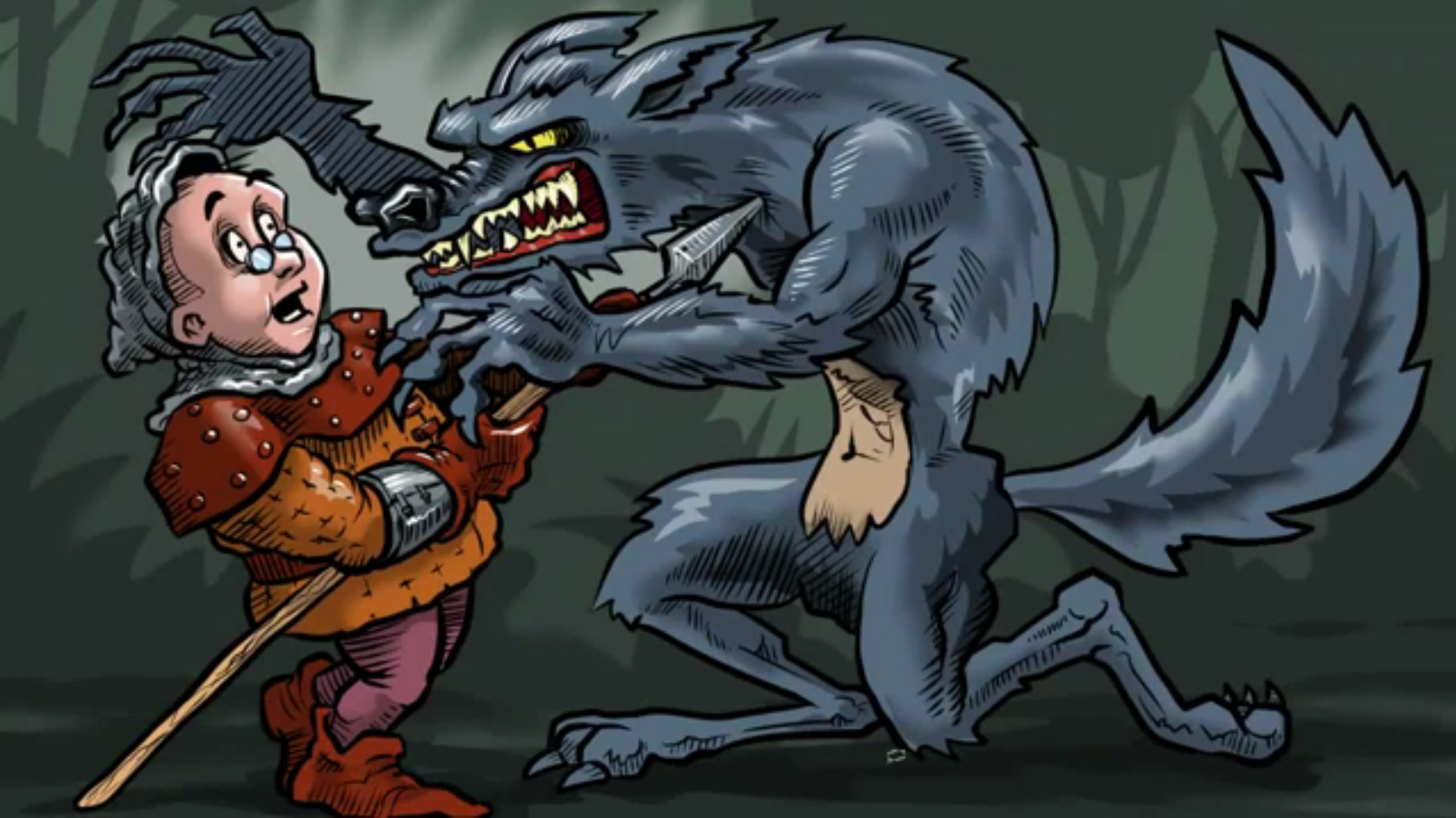
Check out this awesome fanart by Lets Player Das24680. He painted it during a livestream.
Heres the painting process:
https://www.youtube.com/watch?v=S6hjOIHFey0His Lets Plays are also worth a visit!
Cheers
4. May 2015 at 10:58 #2905 GODParticipant
This game has the warhammer (bec de corbin) and the billhook, the kite shield and some high medieval helmets, so it’s not early only. Therefore it must span 900-1200, possibly 1300 even. By 1100 the heraldry was pretty codified according to the basic rules, although the device itself, the charge,t he symbol, was left to the discretion of the noble to chose. Check Norman coats of arms from William the Conqueror’s times… I am not against using outrageous devices, severed orc heads, skeleton necromancer birds, werewolf claws, whatever, but the positioning and colour combinations should have some basic heraldic sense is all.
True on stuff having been implemented from later time periods, which is why I’m in favour of heraldic banners getting put in, but I’m cautioning against making them mandatory. As in, your company being required to have a properly heraldic banner. Because while those rules were prominent around 1200, they weren’t around 900. I don’t mean that that is what you were suggesting, but I was noting it for Psen so that he didn’t feel like he was totally misrepresenting the early medieval period. Keeping heraldic sense for design in mind is still a good idea, because those art designs existed for a reason and were based on older banners and art principles.
Hi Trig,
all these Banners were created using our future banner customization tool wich players will be using when starting a new game.
They consist of the following parts:
Banner shape, Base color, Pattern Color, Main emblem, secondary emblem.
All Emblems have to be combinable with all banner shapes and with all color patterns, otherwise a lot of work will go to waste when painting special emblems which work only in combination with certain color patterns.
Of course these banners dont look as intriguing and as authentic as if i had painted them by hand.When I start working on the final Banner generator I’ll consider your points and maybe change some of the set up to allow for more authentic combinations.
Cheers!
Nice! Allowing for authentic combinations is a good thing to have for those who know how to make them, plus maybe some examples for those that don’t if a help tool is implemented. I actually wasn’t expecting an actual banner tool to get implemented, since so few games have it and when they do it mostly consists of letting you recolor other banners.
4. May 2015 at 15:09 #2930 TrigParticipant
Hi Trig,
all these Banners were created using our future banner customization tool wich players will be using when starting a new game.
They consist of the following parts:
Banner shape, Base color, Pattern Color, Main emblem, secondary emblem.
All Emblems have to be combinable with all banner shapes and with all color patterns, otherwise a lot of work will go to waste when painting special emblems which work only in combination with certain color patterns.
Of course these banners dont look as intriguing and as authentic as if i had painted them by hand.
When I start working on the final Banner generator I’ll consider your points and maybe change some of the set up to allow for more authentic combinations.
Cheers!Sounds good. :)
With the elements you listed “Banner shape, Base color, Pattern Color, Main emblem, secondary emblem” authenticity should be achievable.I would suggest you just adapt these elements to the heraldic rules.
1. Banner shape, ok, this is a banner, it can be any shape really…
2. Base colour, or “Tincture”:

3. Pattern colour. This is where I have a problem. Secondary choice should be “Partition” not “Pattern”!

4. Main emblem, secondary emblem, or “Charge”. This is where you could introduce “Patterns” alongside “Charges” instead of a “secondary emblem”; which is not really a heraldic device. One could chose either a “Charge” or a “Pattern” but not both.

If, for instance one wants an orc’s head as the “Charge” for his coat of arms, he could have it on a single “Tincture” or on “Partitions”, but not on a “Pattern”. So, for instance, a green orc head on a yellow background. Or a green orc head on a quarterly yellow and red background would work. But a green orc head on a yellow and red bendy sinister wouldn’t. It’s either a “Charge” or a “Pattern”, but not both.

What you could do instead of “Primary” and “Secondary” emblem is split the “Charge” in half and then allow picking the colour for each, to enable a two colour “Charge”, but this would probably be too complicated to implement right…
 4. May 2015 at 15:17 #2931
 PsenBattleKeymaster4. May 2015 at 19:41 #2948
 PsenBattleKeymaster
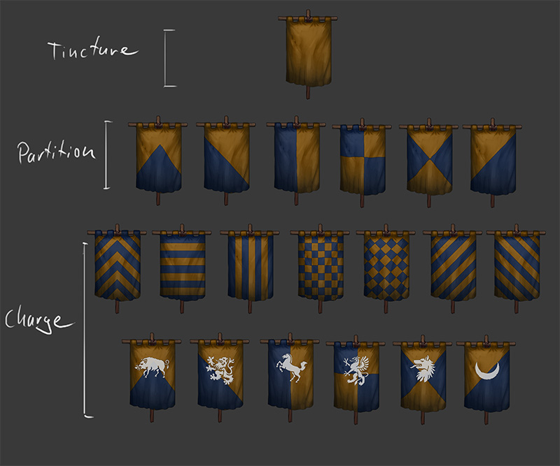
So, i readjusted some things and now I think im on the right way. The system would look something like this.
Including combinations of certain charges with partitions would mean some more hand crafting and special cases, but it would be possible. 4. May 2015 at 21:14 #2954
Sky
ParticipantWow. This topic is awesome. Love the art, the ideas. Keep it up and thank you! ;)
4. May 2015 at 21:54 #2957 TrigParticipant
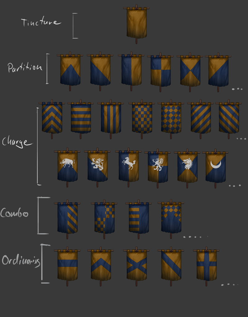
So, i readjusted some things and now I think im on the right way. The system would look something like this.
Including combinations of certain charges with partitions would mean some more hand crafting and special cases, but it would be possible.Brilliant!!! :) :) :)

So in this system, if you combine “per pale” with “bendy sinister” you can get this, yes?

If so, then it’s perfect.Here you also have ordinaries, which can go over the plain tincture, again in the basic colours.

And here you’ve got a big list of charges, for inspiration:
http://en.wikipedia.org/wiki/List_of_heraldic_chargesAnd some more:
http://etc.usf.edu/clipart/galleries/255-heraldry-charges5. May 2015 at 09:48 #2973 PsenBattleKeymaster5. May 2015 at 10:17 #2976
 PsenBattleKeymaster5. May 2015 at 10:23 #2978
 GODParticipant
Getting really excited for this banner system. Really adds a lot of flavour to the game!
I see theres stil a lot of work left, but Im confident I will be able to set up a complex system allowing for all the above features.
…Just have to find the time :) Anyone got some spare time he can send over to me?The trick is to stop sleeping. Sleep just holds you back from your true potential. You might start seeing things that aren’t there, but that’s normal and nothing to worry about. Just ignore it when they start talking.
EDIT: Also, if you don’t want huge smilies when you quote, just remove the image link and replace it with the normal code for that smilie.
5. May 2015 at 14:14 #3016 TrigParticipant
Like so!
Super amazing! :D
Wonderful responsiveness on your behalf.
My hat off to you, sir!Only the Saltire ordinary should prolly be corner-to-corner, same degree slope as you have for bends, since it is basically jut two bends crossed and should have same angle as the Per Bend among Partitions. Same with the Chevron should have the same angles as the Per Chevron in the Partitions, in case they get combined, they should fit the same. Basically all angles of diagonal lines should be same.
A bit about layers and selection steps.
Disclaimer: I may have overlooked some examples where the charge was actually on a pattern too. They’re rare, but some do seem to exist (Coat of arms of Bruges for instance), I only didn’t find ealy-medieval examples of it when first looking, when the goal was to have a party easily identifiable on the battlefield and a device which looked too busy, was hard to decypher… My sincere apologies for this oversight.
1. First layer should be Tincture of course and you choose the colour for this.
2. Second layer should be Pattern, for the purpose that Partition should thenb come over it.
3. Third layer is partition. So now you can have a white Tincture, a red pattern and a blue partition, allowing for instance half the shield be Blue, the other half white and red lines.
4. Fourth layer is the Ordinary in its own colour, on top of all previous stuff.
5. Fifth layer comes the Charge. The charge should fit right in the middle of a crossing of a Quarterly for instance. Perhaps you could also make some charges that are not in the middle, but fit either left side, right side, half a shield only, half a charge (like a half of an eagle or other symmetric charge) etc, so some historic coats could be constructed.
5. May 2015 at 17:06 #3063 AnonymousInactive
to stick on the theme of banners. it would be cool if this translated into the battles as well. I.e. when the players brothers become confident they raises the plays factions world map banner instead of the generic golden dragon on a blue background. Also, the top bar indicating the numbers on either side, could have the battle brother banner versus the opposing them banner. See picture for what I’m talking about.
Note, I used an image versus the beasts faction (whom don’t really have a banner) but hopefully you get the idea…
combat_flags.jpg5. May 2015 at 17:46 #3072 mark_valleyParticipant
Wow! Great job with the banners!
5. May 2015 at 17:46 #3073 PsenBattleKeymaster
The blue flags representing high morale are small sprites painted by hand. We would have to implement a system taking the custom banner from the bannertool and dynamically paste it onto the small flag. If that is even possible it would look rather flat and I think it would consume a lot of ressources to implement.
So thats probably not gonna happen.Cheers!
-
AuthorPosts
- You must be logged in to reply to this topic.

