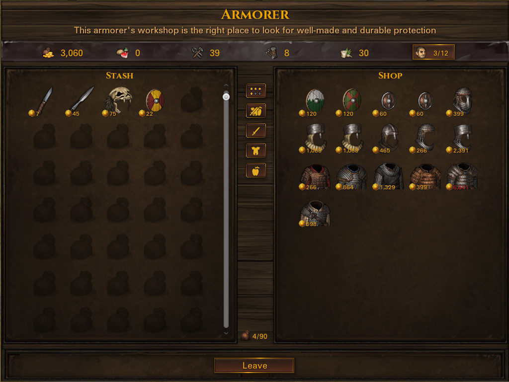
Here we go again. After being delayed a bit while we waited for some technical issues to be resolved, as well as some of us taking a small vacation to recharge our batteries, we’re now back to working full steam on the UI rework. What does it entail? Let’s find out!
What are we doing?
Several things.
First, we’re replacing the third-party UI library we used for Battle Brothers until now. There are a couple of issues we want to solve; there’s a tendency for mouse clicks to be lost, and the UI can feel very sluggish at times. Because this library ceased to be developed and we’re now stuck with all these problems, we can either ignore them or replace the library altogether. We’ve opted to go with the second option, and the result should be a much more responsive UI experience overall, as well as increased performance of the game.
Second, we’re taking the opportunity to make some usability improvements to the UI. We’ll be resizing some dialogs to have you scroll less, and we’ll be adding additional UI functionality.
Third, we’re skinning the UI. The current look, grey and orange, was always intended as a placeholder and not something for the finished game. We’re switching it out for lots of wood and metal in order to have the UI contribute to the game’s atmosphere rather than detract from it, and to give Battle Brothers a more professional look as it nears completion. See below for an idea of how the new UI will look, but keep in mind that we’re still working on it and will be adjusting colors and adding details.
Why do it now?
There’s two gameplay features yet to be added that require quite a bit of UI work: extended roster management and customizable formations. While we’re itching to get these into the game as soon as possible, doing these before the UI rework would potentially mean having to redo their UI again later, thereby wasting development time. We’re doing the UI rework now so that we can then move on to implement both of these features next.
When will it be done?
We’re progressing at a good pace and should have a new build with an updated UI available within the next couple of weeks. The idea is to make it available first as an optional branch of the game – this way we won’t break anything for you and can iron out any potential issues based on your feedback. Once we’re sure that everything works fine, we’ll merge the branches.
Nordic Game 2016
On the 19th of May we’ll head out to Malmö, Sweden, to attend the Nordic Game Conference held there from the 18th to the 20th. The last day of the conference will focus on indie games, making it the perfect place to get in touch with fellow developers, enthusiasts and all sorts of business contacts.
If you want to know more about the event you can get all the details here: http://conf.nordicgame.com/. If some of you should be there as well feel free to drop us a mail so we can meet up and have a quick chat!


Glad to see you guys aren’t rushing and skipping the details! The new UI looks great.
Good luck at the convention. Hope you tech guys leave some time for marketing later on in the year. I don’t know the current sales figure but you seem to be relying exclusively on youtubers for promotion at the moment which might be a problem during the launch window as youtubers don’t often revisit games they’ve already did a let’s play on.
Your own youtube account has some of the smallest view counts covering the game so hope you guys have a marketing plan in place. =)
I do not like how the new trade window looks (background distracts from the goods), but if the interface modifications will help solve important problems for the development of the game – I am ready to accept it
Sadly you guys are not coming to Stockholm, otherwise you would get the royal treatment :) (microbreweries, expert boat tour, and meeting other game makers)
Hey Asterix,
that sounds like an invitation :) Be careful, we might actually do this! ;)
Looks nice :)
“… customizable formations …” That’s just music to my ears!!